2018/09/26

WCW: We're all different & eventually everything mixes

EEM watercolors
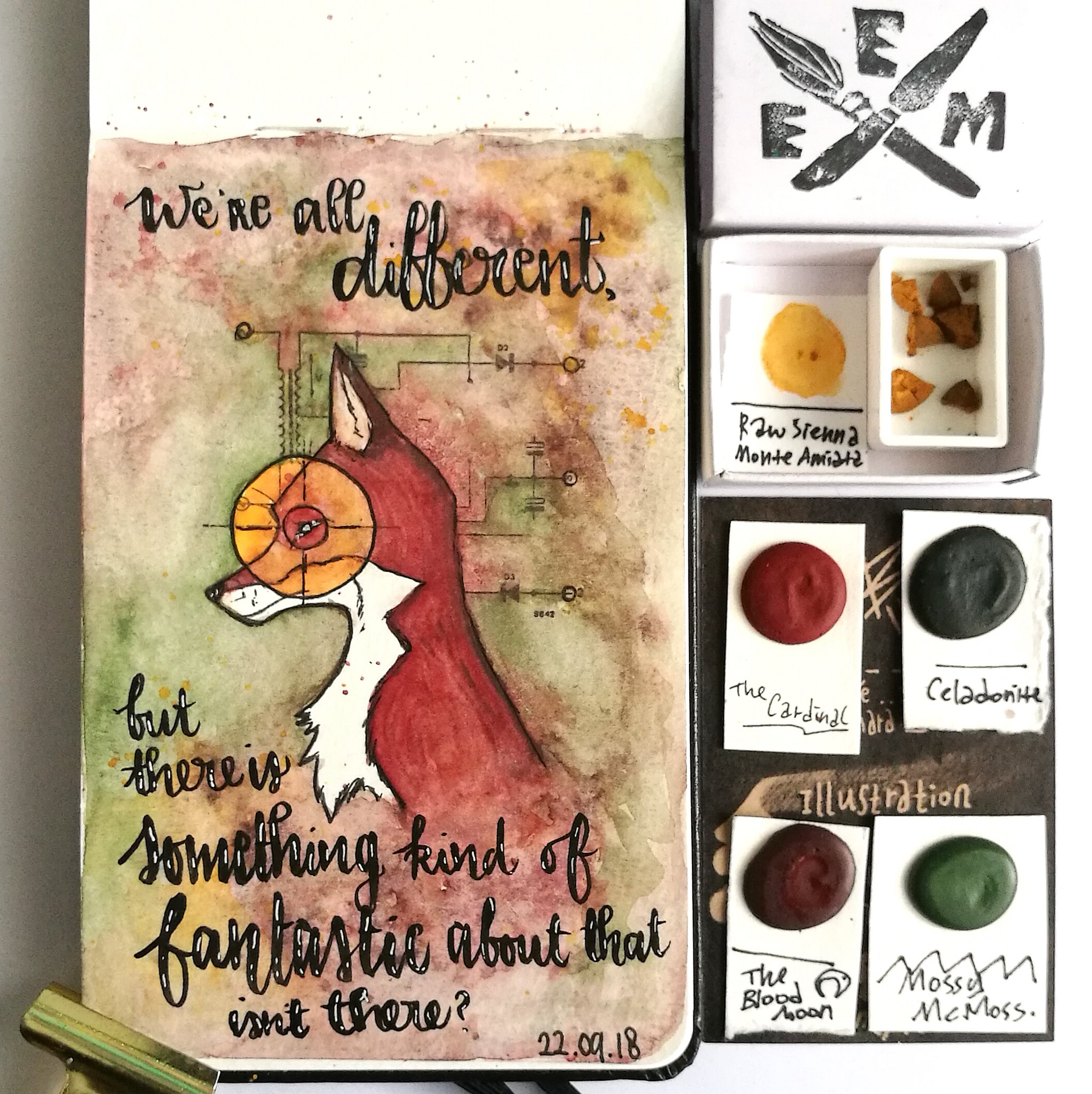
"We're all different, but there is something kind of fantastic about that isn't there?"
- the Fantastic Mr. Fox 

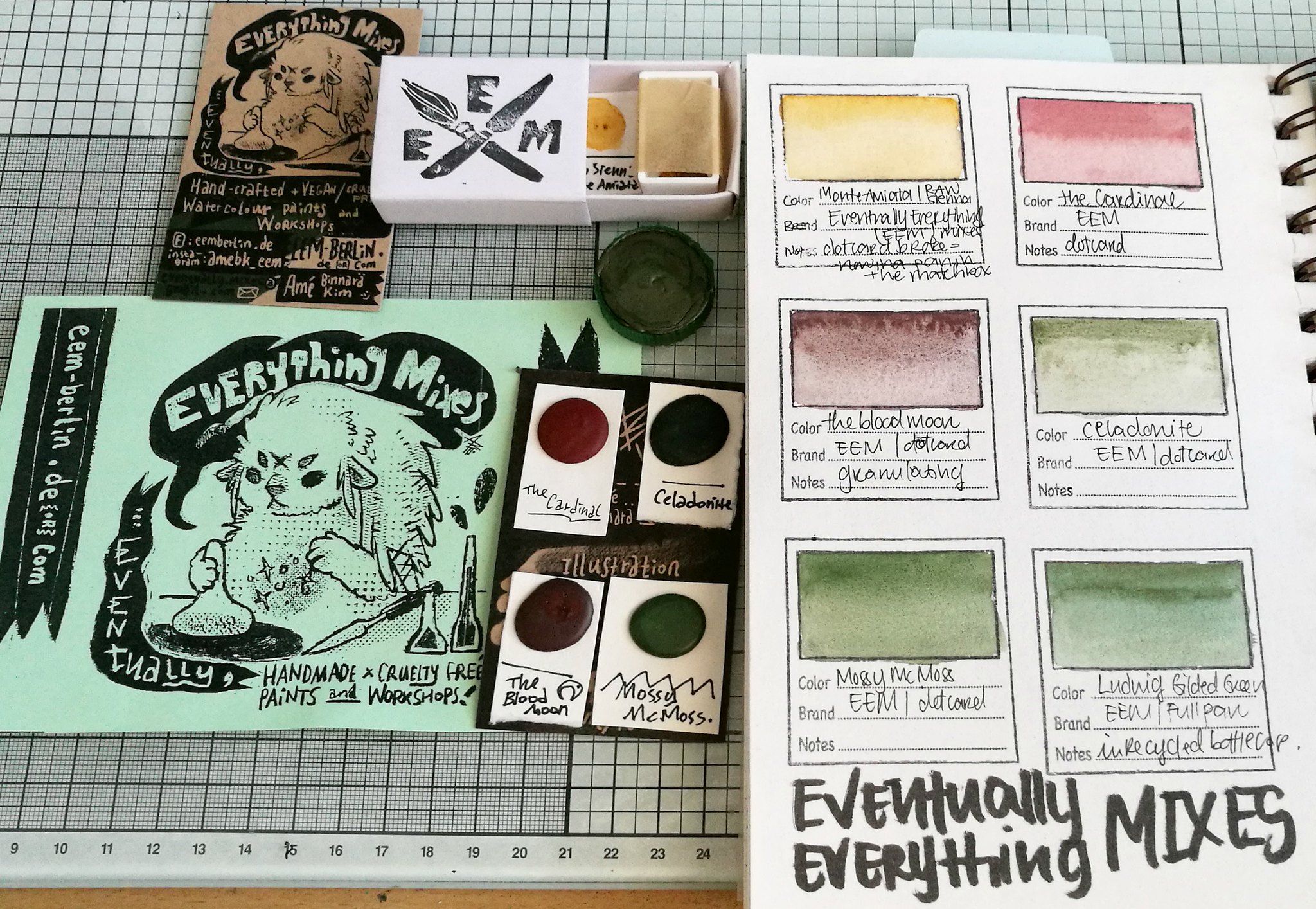
A couple of weeks ago I got my amazing watercolor order in the mail which are made by Amé from Eventually Everything Mixes which is based in Berlin, Germany. She makes "handmade, cruelty free watercolour paints" (as her websites states and I wholeheartedly support!)  and with my order she kindly sent a few of her colors in dot samples which works so amazingly well together & form a beautiful fall palette.

EEM watercolors
The order came in the lovely matchbox and I decided to stick the dots on the business card which then can be placed in an ATC pocket holder for storage. I ordered Ludwig in the "full pan" which Amé uses recycled bottle caps for, which is wonderful! Oh sadly a little dot broke off, but I had some empty pans and could manage to get the most of the pieces in there, so no loss there. Plus this way I also get to use that sweet little matchbox! The sizes of the dots cards are super generous and they will last you quite a while, depending on the size of paintings you do of course! 

EEM watercolors
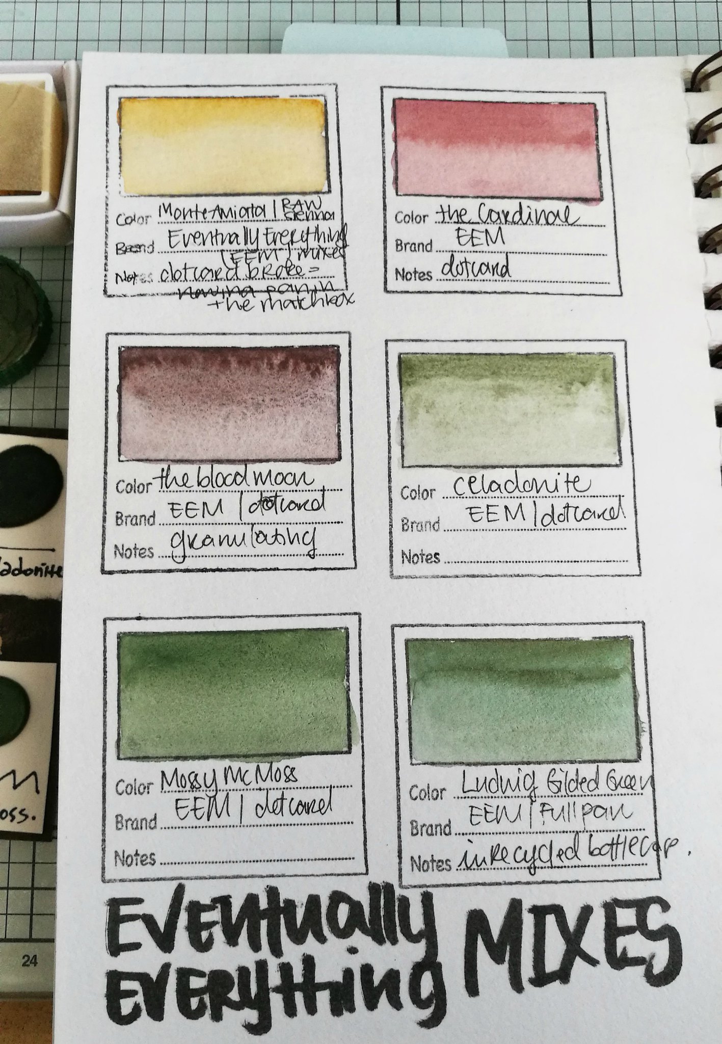
These are swatches of the colors: Monte Amiata/Raw Sienna , The cardinal from the ritual set, The Bloodmoon, Celadonite from her Earthy Trio set, Mossy McMoss & Ludwig (which has a beautiful golden sheen/mica in the paint). I absolutely adore these colors together, some are granulating and have a great dispersion pattern.  Some of these colors are from sets, but eventually she might release them individually as she did with the Berlin set, but that is still unsure at this point. As her paints are hand mulled they are subject to limited stock, so as always it's best to stay updated via Instagram to see when the new update will be online at her shop.

EEM watercolors

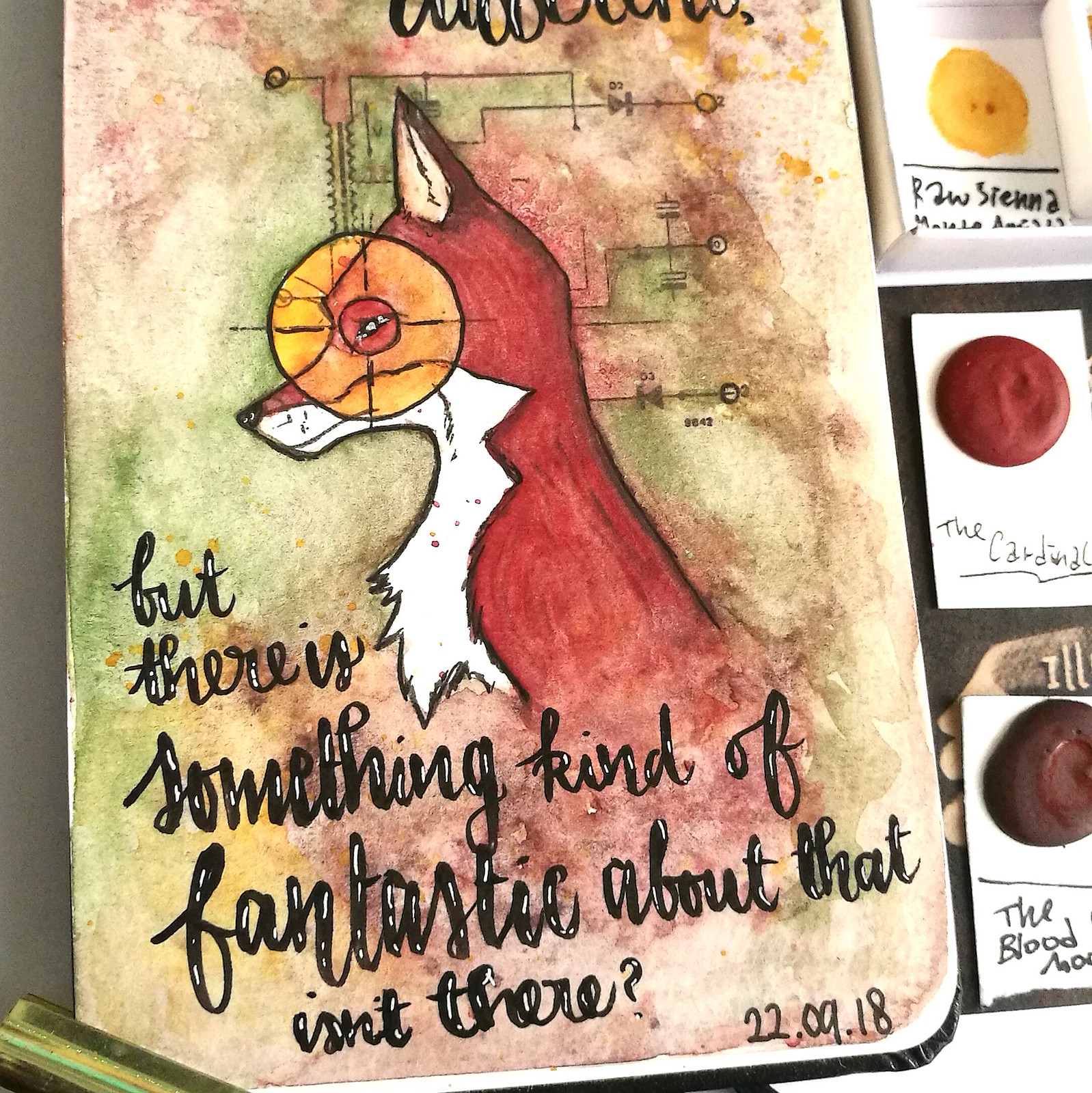
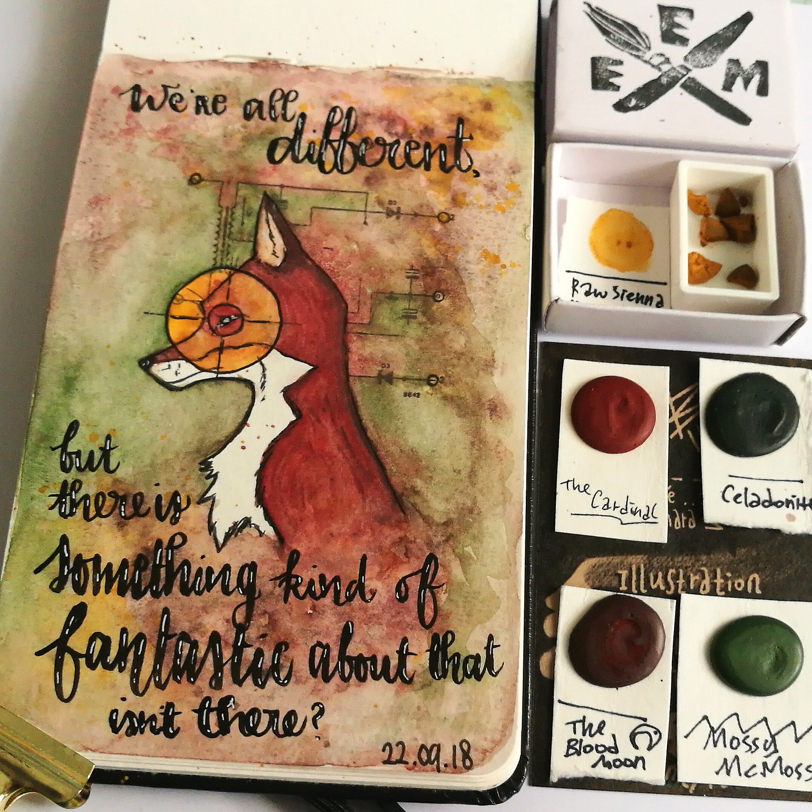
I wanted to see if I could use the dots card colors for a project for fall and I decided to use this great fox stamp designed by Olga Helwein for ALL&Create, which really suited the "mood" I wanted to convey. These colors just play SO nicely together! I LOVE the granulation the Blood moon has, the soft earthy green tones of Celadonite and Mossy McMoss are beautiful for the colors of foliage and gives a nice counterweight to the red brown tones. A pop of the raw sienna as an eye catcher (literally, LOL!) and spatters to blend in the background as a finishing touch to the coloring.

EEM watercolors
The quote is written with Tombow Fudenosuke and highlighted with a sakura gel pen. This was such a wonderful water color play session and I am super delighted to have found a handmade watercolor brand/shop based in Europe :) I'm super excited to see her next newest releases as I do believe she has an awesome unique color range offered at her shop. I mean, check out warlock & Pluto

Adding this art journal page to Art Journal Journey theme of Fantasy - because of the fantastic mr. Fox quote - such a great movie which i highly recommend if you haven't seen it yet :)

Hope you found this week's WCW show and tell useful and hope you have a great rest of the week!
2018/09/21

Art Studio tour and StencilGirl® storage idea

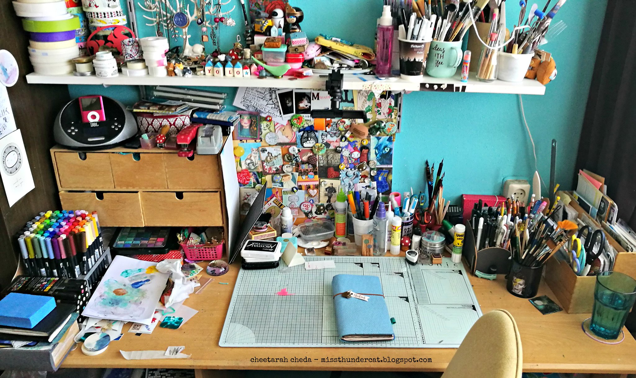
Over at StencilGirl® Talk this month the creative team share their studio/creative spaces and talk about stencil storage solutions. And it's been a while since I shared pictures of my studio, so here is a peek of what it looks like.

corners of my studio
This is my art desk, where I do most of my creative work and have a LOT of stuff going on here which I like to have in reach. Cups with brushes, pens, glue, paper, media etc. I have a different mug for different types of brushes - the Bowie mug holds all my watercolor brushes for example. And the i-pod dock is important - I always have music on when I am working on art journals. Thankfully I'm pretty good at keeping my work surface clean after a project and the blue traveler's notebook has the art journal I am currently working in.

corners of my studio
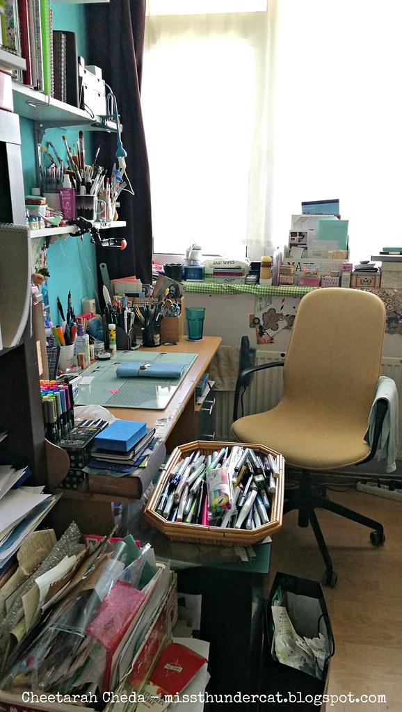
This is what it looks like when you open the door to my home studio - in our apartment we're lucky enough to each have our separate spaces for our creative work. So this room is packed to the brim with art stuff & I  even make good use of the window sill :)

corners of my studio 2
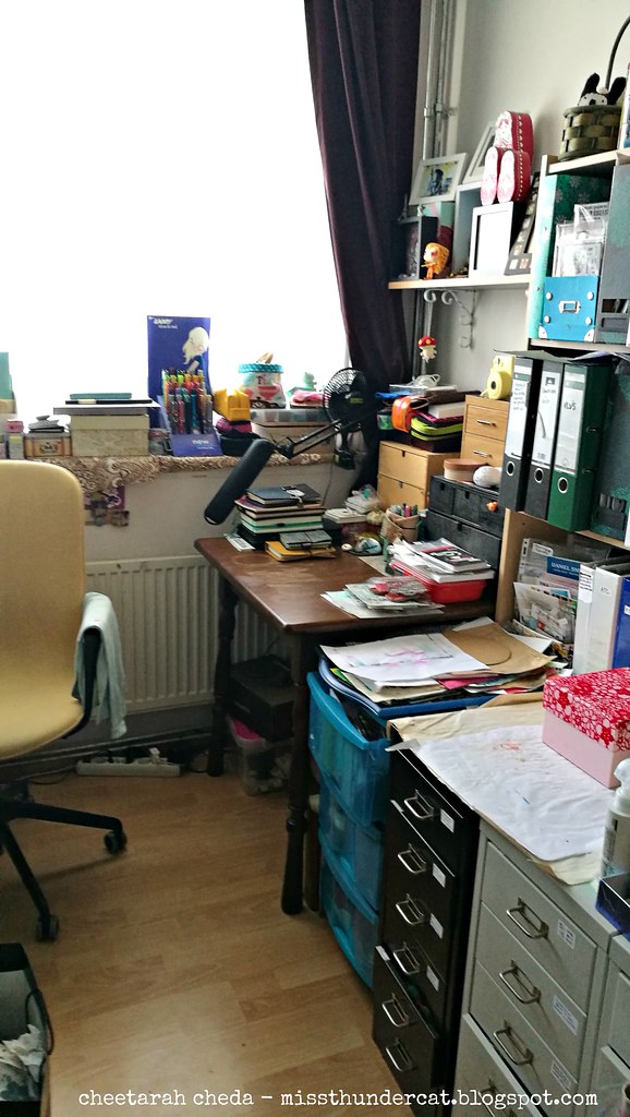
On the other side I have my writing desk which is packed with planners and notebooks. And of course fountain pens. The one thing I do not have here is a computer because I prefer to keep my studio as analog as possible. I also try to leave my phone out but as it's also my camera it's a bit difficult to maintain that.

corners of my studio
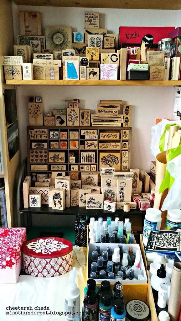
When you step to the right from that angle and face the wall you see my rubber stamp storage, wood mounted stamps. The clear/cling stamps are stored in ring binders. The open boxes contains media sprays and the tins have pigment powders. The lover cabinets placed together make a good extra work surface I use for spray/emboss/die cut work.

corners of my studio 4
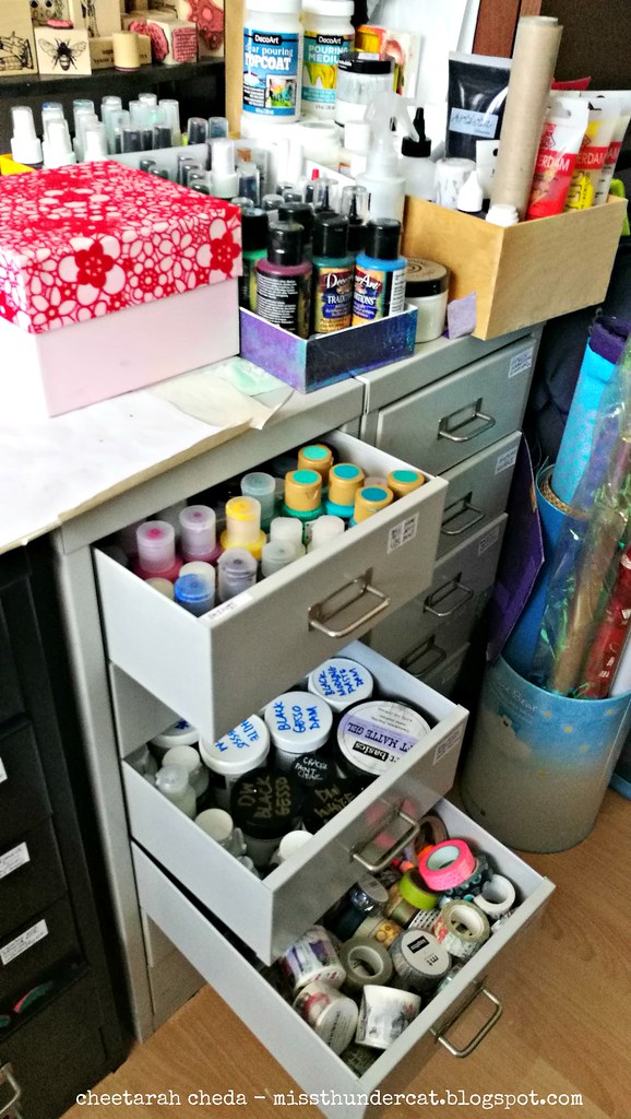
In the drawer cabinets (which were gifted to me by dear friends whom moved away) I store items such as paints, mediums, masking tapes etc. Every drawer has a specific use and are all labeled. 

corners of my studio 5
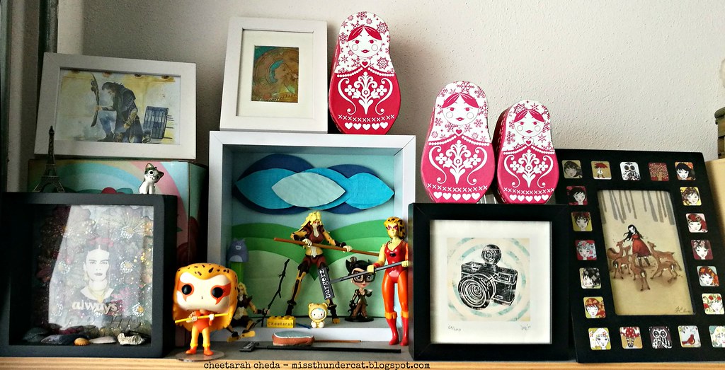
Last thing I wanted to show is a shelf above my writing desk where I store my little collection of Cheetara of the Thundercats toys/figurines :) The one on the far right is an original one of the 1980's. I also have a few prints of her and love getting her drawn by various (comic) illustrators.


Over at my post at StencilGirl® I talk about stencil storage solutions and made a visual reference book of all the SG stencils I currently own. There is also a little video tutorial and flip through. Have a look if you're interested in seeing how I store my stencils & might find this useful for yourself.

That concluded the tour of my home art studio :)
Thank you for stopping by and have an awesome day!

2018/09/19

WCW: Let me be that I am & let's go camping

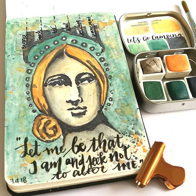
"Let me be that I am and seek not to alter me" - Beatrice from Much Ado about Nothing by Shakespeare. Watercolor play from a few days ago with this gorgeous set from @designsbyrachelbeth I used Toasted Marshmallow for the face (lightly shaded with midnigh

I wanted to share another page from my moleskine watercolor sketch book which I made last week.
"Let me be that I am and seek not to alter me" - Beatrice from Much Ado about Nothing by Shakespeare. 
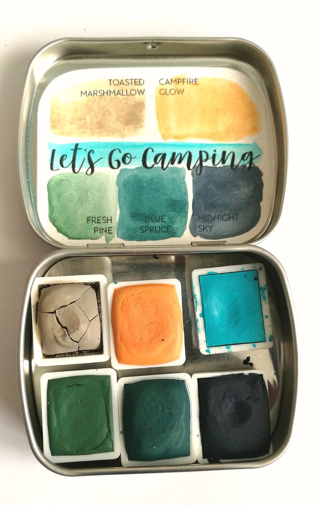
This gorgeous watercolor set is called "let's go camping" from Designs by Rachel Beth which came in the mail earlier this month. I have used Toasted Marshmallow for the face (lightly shaded with midnight) and I'm loving that it looks like a marble statue.  The Beatrice stamp is by Pam Carriker's Art from Stampington & Company which I picked up at Blade Rubber Stamps in London this July. I just LOVE the hand carved stamps Pam Carriker brought out and I bought a few of them for my projects. The lettering made with Tombow  fudenosuke brush pen & highlights with Sakura white gel pen. 

Let's go Camping

This is a pocket sized tin which makes it great for traveling and the color scheme is wonderful for out doors scenery! You can fit another half pan in the tin, which I did and I chose cobalt light turquoise by schmincke for those bright blue skies & compliments the rest of the colors in this tin very well.

Rachel hand mulls her colors and she has batch releases every friday on her Etsy shop. If you wish to stay updated on the releases I suggest to follow her on Instagram where she updates that. I have a few of her sets already and I just love the colors she makes.

I would like to share the top art journal page at Art Journal Journey - continuing with my fantasy women theme for this month :) We all have a bit of Beatrice in us, at least I may hope so!

Thank you for stopping by and have an awesome day!

2018/09/07

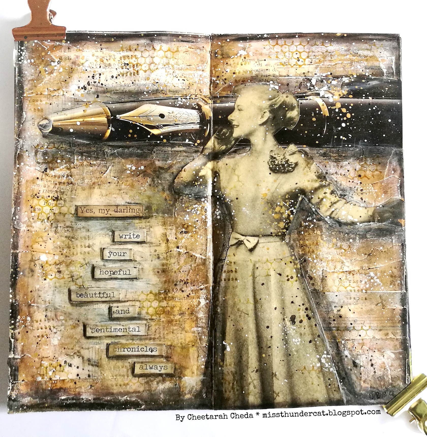
Art Journal: Yes my darling, write your hopeful, beautiful and sentimental chronicles, always

Art Journal : Chronicals

Today I am sharing some inspiration for the September Take it Make it, challenge over at Craft Stamper. I've made a piece with my vintage ladies and pens clippings and started a new size journal, in my traveler's notebook. It says
"Yes my darling, write your hopeful, beautiful and sentimental chronicles, always."
and it has such a beautiful, fun whimsical feel to it. I made this page during my 30 days mini journaling project to fulfill my need for collaging. And it was good to have a bit of a break and do some journaling on a larger scale too :) Below you'll see a a few steps on how I created this spread.

Art Journal Chronicals

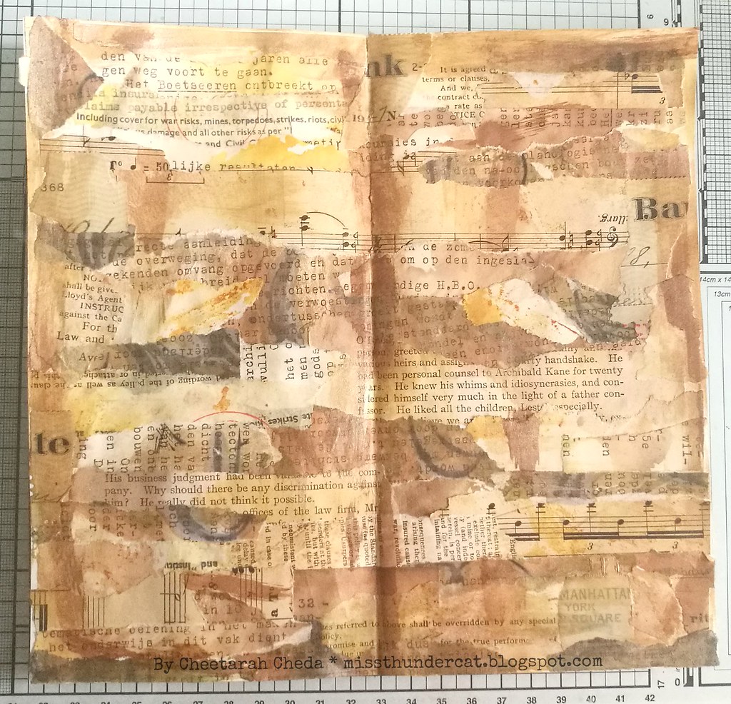
Started off with collaging neutral and "old style vintage" colored papers of which I have plenty of.

Art Journal: Chronicals
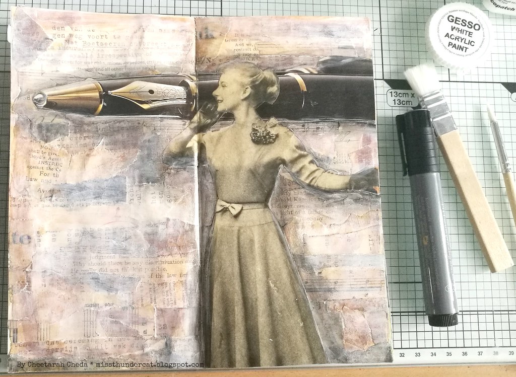
Then added gesso to knock back some color, adhered my focal images with gel medium and created shadows with faber castell pitt marker in grey.

Art Journal: Chronicals
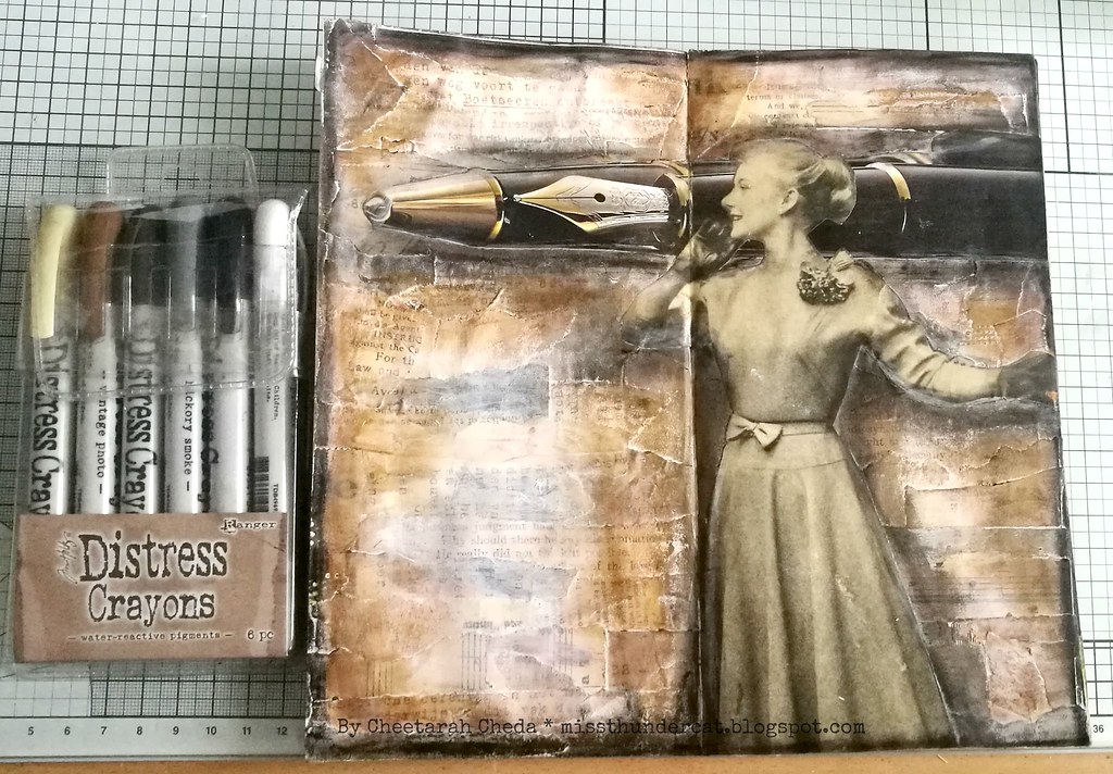
I added some darker accents with distress crayons & created a border.

Art Journal: Chronicals
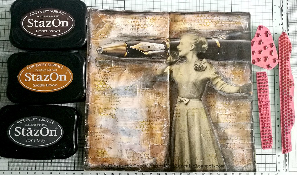
Some stamping for texture. Used a few of my favorites by Viva Las VegaStamps! and Staz-On inks.

Art Journal: Chronicals
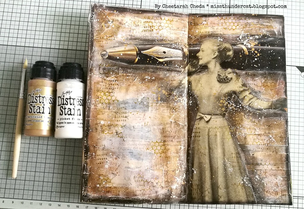
And before I added the sentiment I added some splatters to bring it all together. 

Hope this inspired you to play along with the CS TIMI challenge for this month :) 

Thanks for stopping by and have an awesome weekend!


2018/09/05

WCW: Joan of Art watercolor play (& Review)

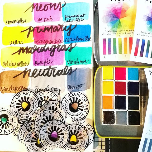
Finally had time to swatch out the watercolor sets I bought from @joacreations weeks ago. They are very vibrant and love the fact that with every set you get to see the colors you can mix with them on the back of the card. Also love their labels!! ____ #w

A few weeks ago I ordered some fun watercolors from Etsy by the brand Joan of Art and I finally had time to play around with them a bit. I've bought the 4x aquarel sets and you could choose which of the sets you would like to have included. They at the time had a limited edition set called Mardigras and I added that one instead of their earthy tones set. The shop is based in the UK, so shipping to NL was fairly priced (36€ for 4 sets including shipping) and they arrived in a little over 12 days. Bit slow than average from UK, but the UK mail and NL mail delivery were having some issues around that time, so they could be delivered to you faster.
But they arrived, beautifully packaged and I just LOVE unwrapping watercolors! It's like colorful candy but so much better & healthier for you ;) I love that they come with a card which shows you the colors you can mix with them. I do keep the wrappers in a sketchbook with watercolor swatches, but here they are all piled up and the colors swatched out for you to see. They are definitely very pigmented and lovely to work with. The pans come with a little magnet attached to the back so you can create your own palette in an Altoids tin or other metal tins. They also have a fun Watercolor Sketch tin available if you want a complete travel set. The swatches you see here are made in my Strathmore visual journal, with 100lbs watercolor paper.
You can find more information on Joan of Art HERE. Joan of Art (seriously though, what a cool name for an art supply product company right?!) was also kind enough to provide the pigment info on their blog in case people are wondering which pigments are in the set. The Mardigras set was a limited release and sadly already sold out. 

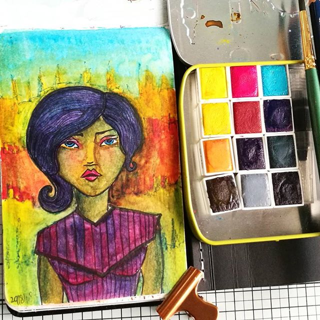
Watercolor practice sketch in my moleskine watercolor pocket book from a few days ago, to test out the @joacreations watercolor sets. The face has a starting base of a @janedavenport clear small face stamp. Not sure if I like it. The sketch, not the paint

I did a quick color sketch in my moleskine watercolor pocket sketchbook. The base is a small face from the Jane Davenport face stamp set. I drew the rest of the body with a faber castell pitt marker and added some accents with a stabilo all blue pencil (which also activates with water) I was wondering if I could create a skin tone color with all these bright sets and made a mix of van dyke brown with golden yellow and added accents of permanent rose for cheeks and indigo for the shadows. So this sketch was done at night when I didn't have natural light and at first I just didn't like it, too yellow in the face. Later when when I added more blue in shading and warmer tones in orange red around the face in the background the color of the face looks more as a tanned/east asian/indian skin tone. Still really need to practice more but that is what these sketchbooks are for - to play and practice color combinations and see what it brings you. These colors are definitely fun to play around with and I would certainly recommend them to fellow watercolor enthusiasts at any stage in their journey.

Sharing this painting sketch of at a fun - new to me blog- Paint Party Friday.
Art Journal Journey - this month's theme is "world of Fantasy" and this woman borne out of my fantasy also lives in a fantastical colorful world. In my fantasy the world always appears way more colorful as well.  

Hope this little review of the paints was useful.
Thanks for stopping by and have a wonderful day!


Disclaimer: I was not compensated for this review & bought these paints with my own money and all views posted here are my own.